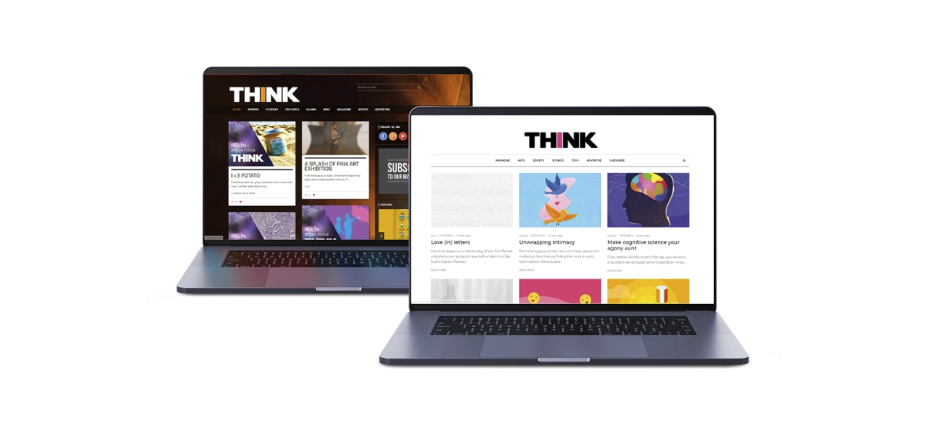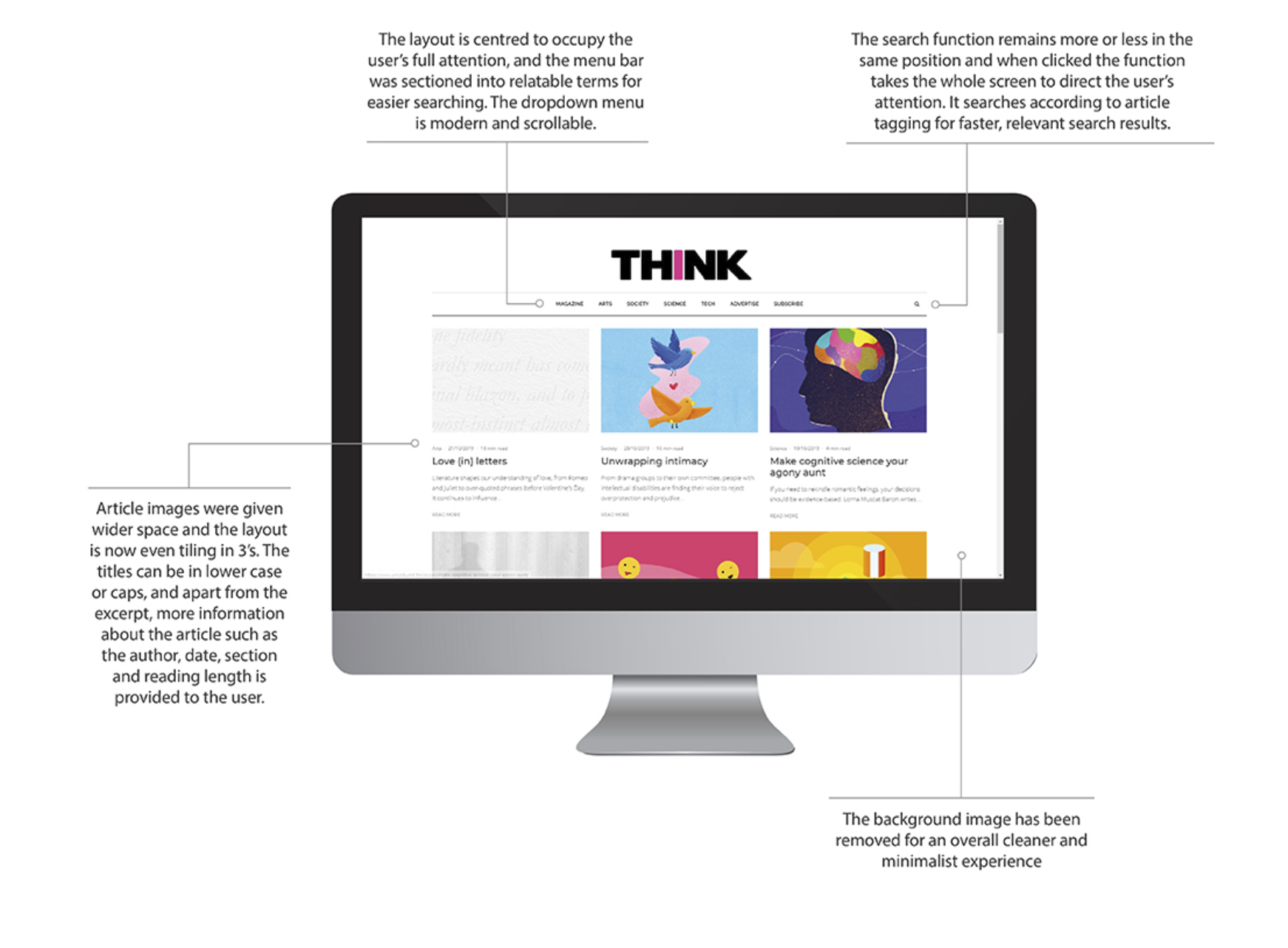
The legacy THINK site had accumulated seven years of design debt: a busy background, irregular tile grid, bland drop-downs, unclear section labels (e.g., Alumni, Misc), and an unreliable search that trawled body text instead of titles and tags. Important reading cues and onward journeys were hard to find; related content was thin; the site wasn’t fully device-responsive. Qualitative testing of the old experience surfaced frustration and confusion, especially around navigation and search. The goal was to deliver a polished, minimalist reading experience that improved article discovery, reduced search friction, and supported subscription growth without compromising accessibility or performance.

Work began with a heuristic and analytics review to locate friction points in navigation, search, and content density. We ran open/closed card sorts to validate a topic-based taxonomy, then moderated usability tests with 15 participants (actual subscribers, students, and researchers). Core tasks: find an article by topic, subscribe, and discover related reading. We tracked task success %, time on task, SUS, and captured qualitative quotes. Insights were consistent: legacy labels were unclear; search indexing ignored tags; readers wanted stronger wayfinding (related reading and section cues), visible reading-time indicators, and suggestions aligned to their activity. A final round of testing compared three functional prototypes; preference and task performance converged on the model that combined a cleaner grid, full-screen search, and explicit topic chips.
Post-launch behaviour indicated materially better findability and flow. Related content patterns and clearer labels reduced dead ends; tag-aware search and facets cut search churn; mobile scannability improved through larger type and spacing. Editorial velocity increased thanks to a simplified content model and tagging discipline. Online subscriptions increased by 23% within six months of release. Early retention signals also improved in the first two months versus the prior site (qualitative uplift observed in testing sessions and usage patterns).
We instrumented GA4 to track the full discovery-to-subscription path—search start → result click, scroll depth, related-article CTR, and subscribe initiation/completion—against pre-launch baselines. On-site search logs monitor zero-result queries, exits after search, and emerging synonyms to refine ranking and labels. A lightweight dashboard reports weekly to editorial and quarterly to product, feeding a scheduled taxonomy review and targeted A/B tests on labels, cards, and related-content placement.
We formalised a lean content model (Article, Author, Topic, Series) with required fields and ownership, and introduced a tagging guide (max five tags, approved topic list, managed synonyms) to keep IA coherent. A publishing checklist enforces accessibility (alt text, headings), SEO (meta, OG), and performance (image sizes, lazy loading). Editors were onboarded via workshops and a concise playbook to sustain quality and consistency post-launch.
